Email design is a crucial aspect of digital marketing that can significantly impact the success of your campaigns. In this article, we will explore some of the best examples of beautiful and effective email designs. By analyzing these designs, you will gain insights into what makes them stand out and how you can implement similar strategies in your own emails.
1. Airbnb

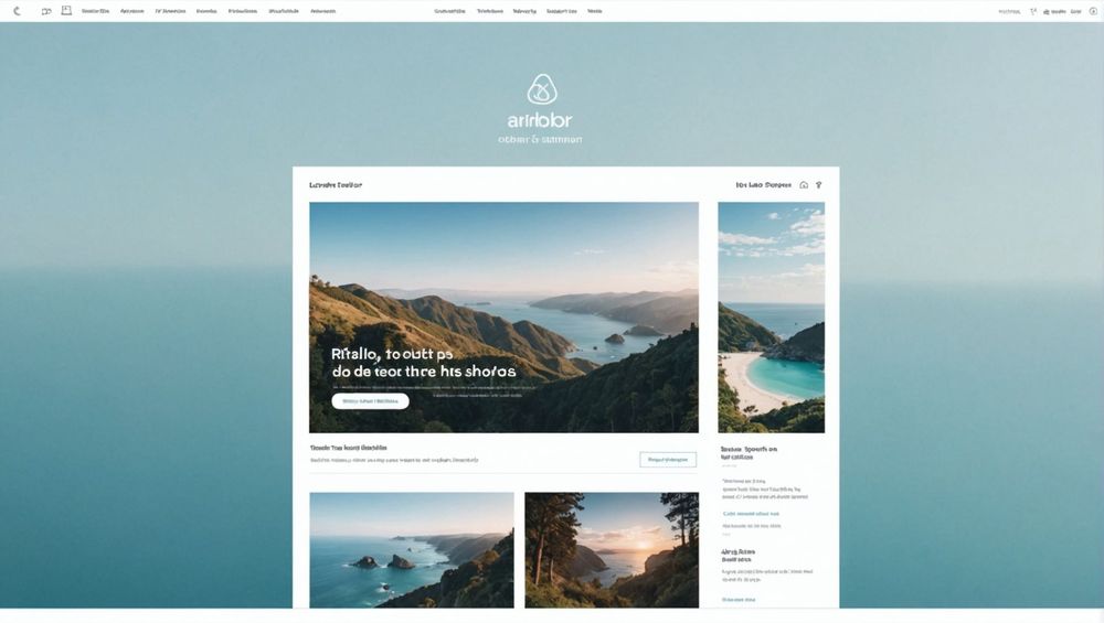
Airbnb is renowned for its clean and visually appealing email designs. One standout feature is their use of high-quality images, which immediately captures the recipient’s attention. Additionally, Airbnb utilizes a minimalist layout that makes the emails easy to read and navigate. Clear call-to-action (CTA) buttons are strategically placed to guide users smoothly through the email, ensuring higher click-through rates.
The color scheme is consistent with their brand, using soft blues and whites that evoke a sense of trust and calm. The typography is simple yet effective, making the text readable without overwhelming the reader. Lastly, Airbnb often incorporates user-generated content, such as reviews and experiences, to make the emails more engaging and authentic.
Why Airbnb’s Design Works
Airbnb’s email design succeeds for several reasons:
- The aesthetic appeal captures attention quickly.
- Minimalist layout ensures easy readability and navigation.
- Effective use of CTA buttons boosts engagement.
These elements combine to create a seamless experience that aligns with Airbnb’s brand values, making it a great example of effective email design.
2. Apple

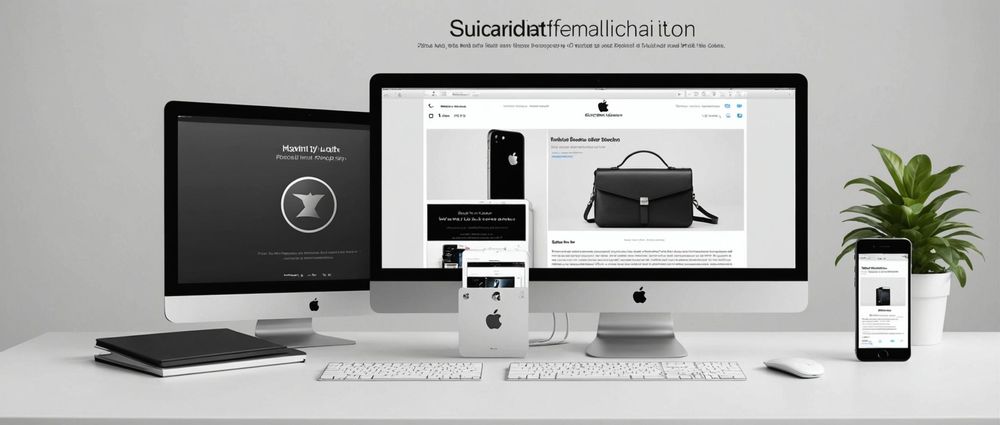
Apple’s email designs are a masterclass in simplicity and elegance. They often employ a monochromatic color scheme, predominantly using blacks, whites, and grays, which makes the product images stand out. The layout is generally uncluttered, focusing on one primary message per email, which aids in maintaining the recipient’s attention.
Apple also excels in product showcasing, using high-resolution images that highlight the features and design of their products. Each email concludes with a clear CTA that often leads to their website for more detailed information. This focused approach ensures that recipients do not get distracted by too much information at once.
The consistency in their email design mirrors the brand’s overall design philosophy, making each email a true extension of their brand identity.
3. Spotify

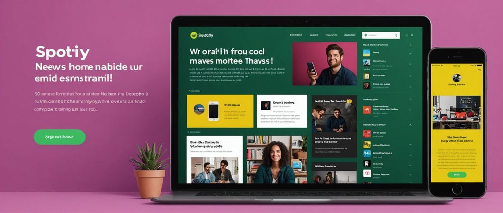
Spotify’s email designs are colorful and engaging, often reflecting the vibrant nature of music itself. They use bold colors and playful graphics to create excitement and keep the user engaged. One of Spotify’s strengths is personalization; they frequently include customized playlists or recommendations based on the user’s listening history.
The layout is user-friendly, breaking down the content into easily digestible sections. Icons and thumbnails are employed to make the content more visually appealing and to guide the user’s eyes sequentially through the email. Their CTAs are also strategically placed to encourage immediate interaction, whether it’s to listen to a new playlist or explore new features.
Spotify’s email designs often incorporate data-driven insights, such as listening habits and trends, making the content highly relevant and personalized for each recipient.
4. InVision
InVision’s email designs cater specifically to designers, and this audience focus is reflected in their visually stunning and highly functional emails. They use a lot of white space, which provides a clean and uncluttered look. This helps to focus the reader’s attention on the main content and CTA buttons.
The use of high-quality images and illustrations enhances the visual appeal, while the text remains concise and to the point. InVision often incorporates success stories and case studies into their emails, which adds an element of authority and trust. These stories are generally paired with vibrant images and straightforward CTAs to encourage engagement.
If you are looking for inspiration on design-centric emails, InVision is a go-to example that brilliantly combines aesthetics with functionality.
5. Uber
Uber’s email designs are characterized by their simplicity and efficiency. They often use a lot of white space, which makes the emails look clean and professional. The content is generally concise, and important information is highlighted with bold text or colors to draw attention. This makes it very easy for recipients to quickly grasp the main message of the email.
Uber also excels at incorporating user data to make their emails highly personalized. For instance, emails might include details about the recipient’s recent trips, including a summary of ride times and costs. This level of personalization not only makes the emails more relevant but also builds a stronger connection with the user.
The CTAs are clear and to the point, often encouraging users to update their app, book a ride, or explore new features. This straightforward approach makes Uber’s emails effective and user-friendly.
Conclusion
Beautiful email design combines aesthetics and functionality to create an engaging and effective communication tool. Whether it’s the minimalist elegance of Apple, the vibrant personalization of Spotify, or the clean professionalism of Uber, these examples demonstrate various ways to capture and maintain your audience’s attention. By incorporating high-quality images, clear CTA buttons, and personalized content, you can elevate your email marketing campaigns to achieve better results.
FAQ
1. What makes an email design beautiful?
A beautiful email design often combines visually appealing elements such as high-quality images, a well-chosen color scheme, and an uncluttered layout. It also focuses on functionality by including clear CTAs and ensuring easy readability.
2. How important is personalization in email design?
Personalization is extremely important in email design as it makes the content more relevant to the recipient. Personalized emails have higher engagement rates as they cater to the specific interests and behaviors of the user.
3. Why are CTAs significant in email design?
CTAs, or Call-To-Action buttons, are crucial as they guide the recipient to take the next step, whether it’s making a purchase, reading more, or signing up for a service. Well-placed and clear CTAs can significantly increase the effectiveness of an email campaign.
4. Can user-generated content boost email engagement?
Yes, including user-generated content such as reviews, photos, or experiences can make emails more authentic and engaging. This type of content adds social proof and makes the email more relatable to other users.
5. How does white space influence email design?
White space, or negative space, is important as it makes the email look clean and organized. It helps focus the reader’s attention on the main content and CTAs, making the email easier to read and navigate.